The Project
Ukiyo is a unique development of luxury apartments in the heart of Prahran, a stylish and contemporary suburb of Melbourne.
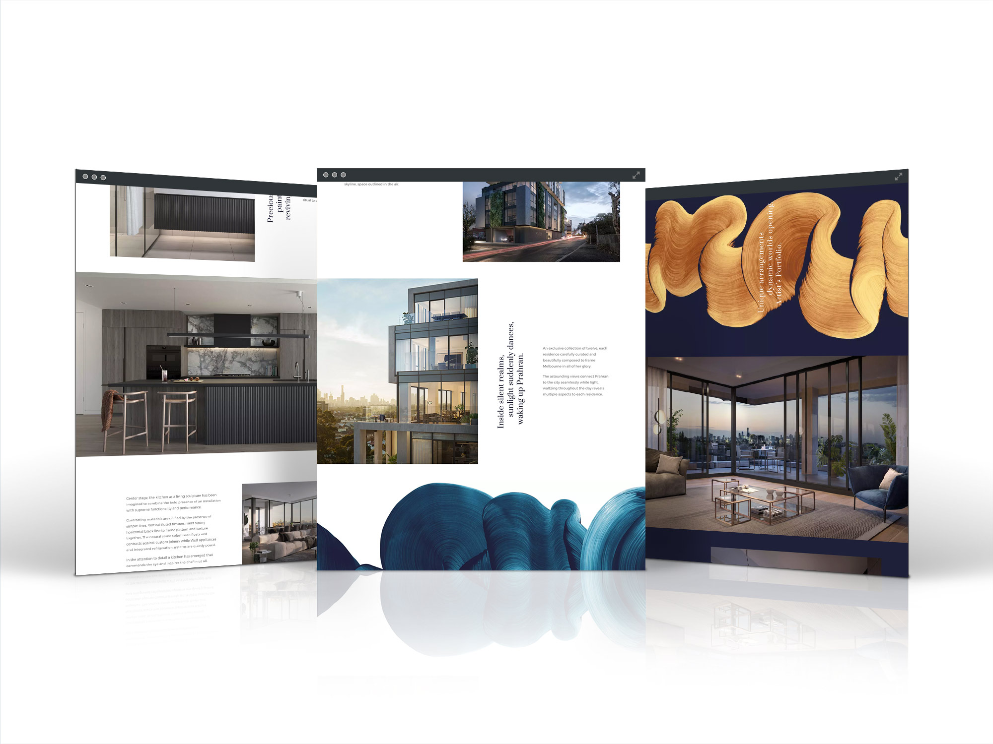
The brief from Chapter Group was to design and build a website that encapsulated the qualities of the building's architecture, influenced by Japanese fashion designer Issey Miyake. Ukiyo means 'the floating world' and the brand's identity is about flow and water connecting seamlessly with the surrounding neighbourhood.

The creative bit
To translate the Ukiyo brand with its feeling of space, layers and floating.
The website had to echo the architecture and quality of the stylish apartments, with the aim of securing registration from interested potential customers.
The difficulty was to combine the layered and floating nature of the building with the feeling of flow and movement of Ukiyo's paint stroke brand. Somehow this feeling had to be represented in the digital platform. The addition of some subtle movement would assist in capturing the essence of the development.
The Outcome
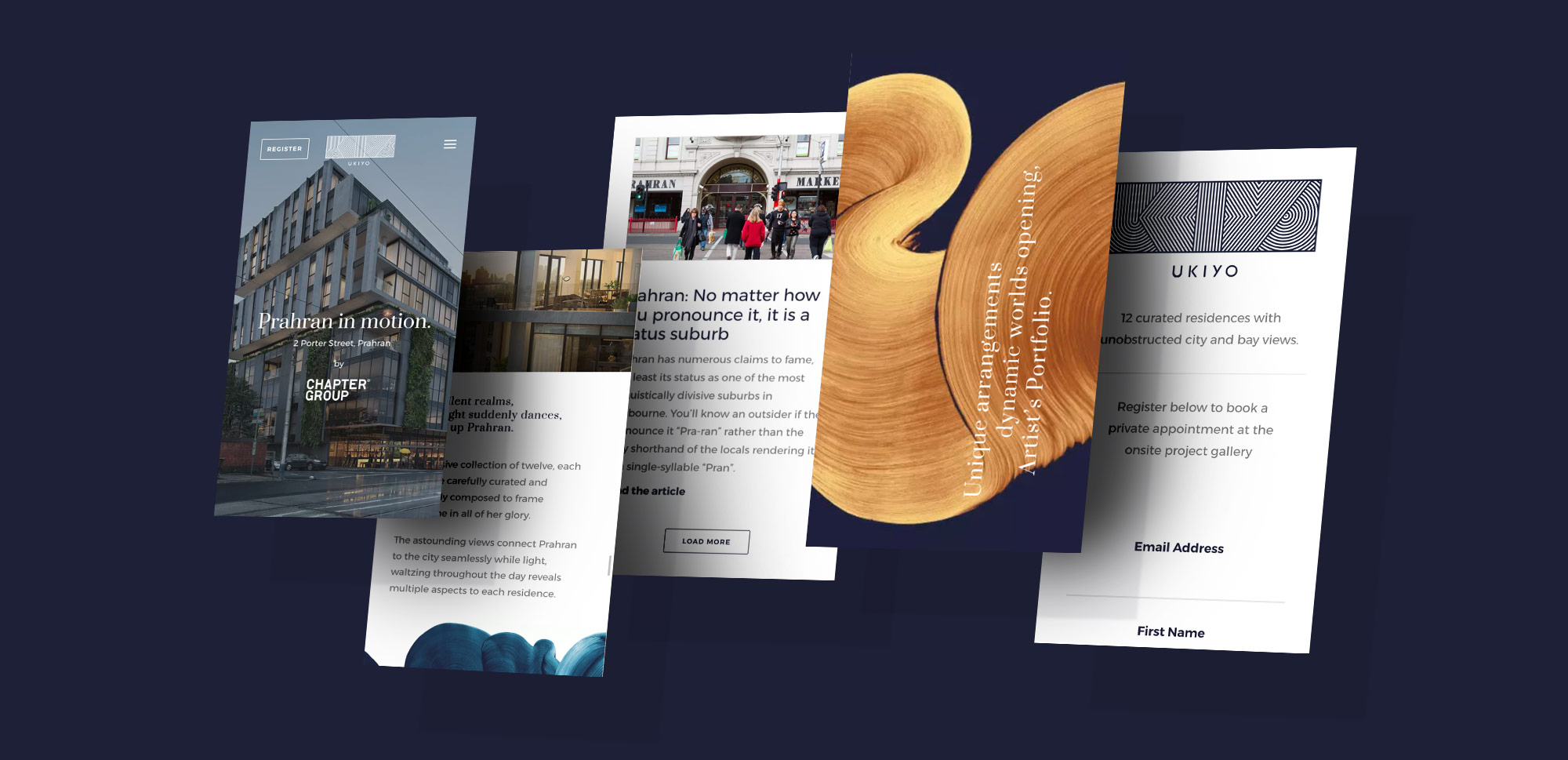
- Strong use of visuals that emphasise the quality of the apartments, in an off center layout, that mimicked the architecture.
- Use of a cinemagraph of the bedroom drape blowing in the breeze adds a feeling of tranquility and freedom, achieving the combination of movement, flow, architecture and luxury.
- Sticky navigation for consistant access to the registration form.

The good the bad & the unusual
The construction of the appartments had only just started on site, so having great visual renders to showcase the quality of the apartments brought it to life.
The cinemagraph animation elevated the site to a level way beyond the printed brochure.
A decision to turn this into a one-page design gave a stronger sense of journey and flow through the building and content.
The language of the written content was inspired by the haiku's poetic style, taken from the brochure. Whilst this can be artistic, the site would have benefited from more information about the development rather than just elequoent prose.
Initial designs had several action points for the user to register. The client's preference was for a single register button. The first option may have generated a higher conversion rate.
The client wanted a cloudy, rainy hero image. Why? Partially to stand out from the crowd but mostly because rain is a novelty in Melbourne. The client loved it.
- Pre-Work
- Initial meeting & brief
- Competitor research
- Functional spec
- UX
- Sitemap
- Wireframe
- Content flow
- UI
- Animation
- Visual website design
- Production
- CMS Theme
- Build

